Category Archives: Experience Design

UI, UX, Customer Experience, Design, Managing Expectations, etc.

Clear + Leap Motion: A Clear Leap Forward?

RealMac Software posted a demo video showing how their Clear app for Mac might work with the Leap Motion controller.

clear for mac and iphone

Leap Motion provides a sensor that allows you to interact with your computer through simple hand gestures. It’s the interface idea made famous in the movie Minority Report and builds on the camera tracking techniques used for XBox Kinect. Simple swiping and pointing allow you to interact and make changes on your computer. What could be cooler than that?!?

clear_swipe

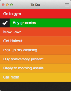
Now, RealMac has begun work to support the Leap Motion controller in their list app, Clear. This app has already gained a lot of attention by simplifying the list app down to its essence and by presenting it in an intuitive app with a Flat, minimalist look-and-feel. The app lets you mark to-do items as done by simply swiping. You can stretch a point in the list to create a new item. There is almost no visible interface since it is mostly gesture driven.
I highly recommend checking out the video and check out the Clear app also if you haven’t already. You’ll be glad you did.

First Look: Sony PlayStation 4. Any Game Changers?
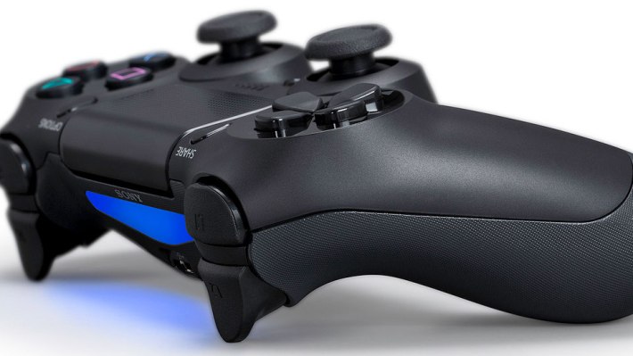
ImageSony held a special conference last night to introduce the new PlayStation 4. I think the most notable thing about the conference is that they failed to actually introduce the console. Sony didn’t show the console hardware and they didn’t announce any pricing or availability. I’m not really sure they even confirmed the name or anything. After all, Sony’s webpage simply says “PlayStation: See the Future” and directs Twitter traffic to the #playstation2013 tag
So, what did we see that matters?
There’s the mundane and expected:
  • Lot’s of studios working on great games.
  • x86 chip, 8GB RAM, huge hard drive, etc.
  • Camera.
  • Social gaming network
There’s the Questionable:
  • Can’t play your old Playstation games, streaming only
  • Touchpad on the controller – bad location and what’s the point
Image
There’s the New and Notable:
  • DualShock 4 controller finally gets some curves and comfort.
  • Continue games on PS Vita portable console (if you have one)
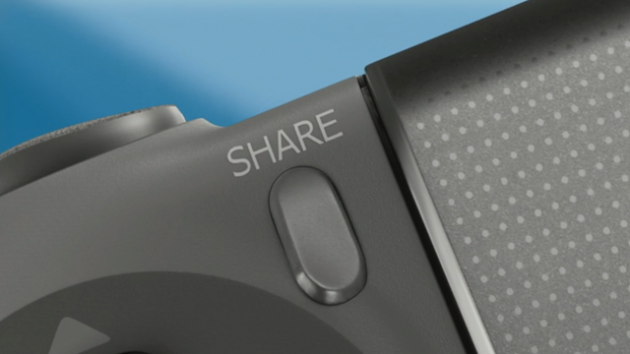
  • A “Share” button right on the controller
Image
I Spotted One Experience Delight:
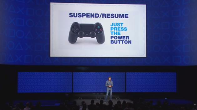
  • I love the instant Suspend and Resume from a power key on the DualShock 4. That definitely reflects modern computing appliances like smartphones and tablets, but it is not a game-changer by itself.
 Image
I hope there is much more to come from Sony on this generation. I don’t think instant on/off is enough to stand out. I do understand that the serious console gaming market is really about the games. Sony is delivering in that area and the games looked impressive. Still, they held out on showing the console design itself at the Introduction. Why?
Images from Sony and Kotaku.com

HTC Ultrapixels vs. Megapixels: Where Experience Design and Marketing Clash

Image
HTC’s latest flagship smartphone, called the HTC One goes against the megapixel trend in smartphone cameras. They have introduced the new Ultrapixel Camera in the HTC One that promises to achieve better pictures with a 4 megapixel camera than the competing flagships from Apple and Samsung with higher megapixel specs. They have decided to focus on actual image quality. While this is noble and certainly could benefit the HTC customer, it could be a big challenge in the sales and marketing department.
 
The Megapixel Myth
When we Product Planning Pros market a new phone, we always want to promote some differentiating features so that the phone stands out in the crowd. Sometimes, we have to include certain features as ‘entry tickets’ just so the market will recognize it as a credible contender for the market’s mighty buck. Since camera phones entered the scene in 2005, the push has been for ever-higher pixel counts. For a while you wanted to claim a megapixel camera, then it needed to be more megapixels, and now, 5 to 8 megapixels is the entry standard in smartphones, with some offering up to 41 megapixels.
 
Many in the mobile device industry, including prominent reviewers and bloggers, have pointed out that there is more to a camera than the megapixel count. Yet, that is exactly the main thing that has been marketed to consumers. Like clock speed or cores in processors, more megapixels sounds like more to the consumer. What other information do they have when they visit their local shop to compare phones.
 
Is Ultrapixel a Better Camera?
The first distinguishing factor is the pixel size in the image sensor. It’s simple physics that a larger sensor can capture more light in less time given the same lens. So, HTC claims that each ‘pixel’ in the sensor collects 300% more light than certain competing 13 megapixel cameras.
 
Image
 
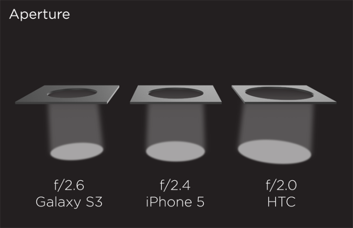
Second, the Ultrapixel camera achieves the largest aperture in the smartphone market at f/2.0 which is 44% more than iPhone 5’s f/2.4 aperture. Capturing more light overall means that the camera will offer better contrast and color in low-light conditions and will show less blur when capturing fast action since the shutter speed can be faster. It also results in less noise in the image since more light is measured to even out the gaps.
 
Image 
 

Another advantage touted by HTC is the ISP (Image Signal Processor) to fully accommodate real-time video and image processing. Since there are less pixels, it is easier to achieve the processing throughput to keep up with the signals coming in from the camera. This means the camera can capture full-size images in the video capture without compression or other lossy techniques that degrade the image.

 
So, if we ignore megapixels for a second, we can see that this camera module is more in line with a compact digital camera than even the best camera phones. The pixel size and the aperture both set it apart from most smartphone cameras. It remains that the biggest downside is that it doesn’t compete on megapixels.
 
Will It Matter?
Megapixels matter according to most of the consumer research that I’ve been privileged to participate in or review. Most consumers are familiar with the term and equate it with a better camera. In fact, most consumers don’t differentiate the megapixel camera rating from the video capabilities, which is definitely recorded at a much smaller resolution (Full HD video is only about 2 megapixels).
 
The extreme megapixel example in the market was the Nokia 808 with a 41 megapixel camera. Nokia used the megapixels to deliver oversampled images (combining data from multiple pixels into one in the final image) and to allow for a better digital zoom experience. The reviews for that camera were pretty strong overall, with little complaint about the image quality, and much exposure due to the extreme megapixel rating.
 
Marketing Reset
I think that HTC recognizes the uphill battle they are taking on and have decided to try for a marketing reset for the camera. They seek to re-frame the customer’s decision process regarding smartphone camera expectations.
 
Their marketing reset starts with the Ultrapixel Camera name for their solution to sound like it’s better than the standard megapixels that other cameras offer. They have created a website to explain the camera and are trying to educate the consumer about their design efforts. I have also seen some mainstream press already discussing Ultrapixel as a departure from the megapixel myth, so likely they have executed a solid PR effort to achieve that.
 
Image
 
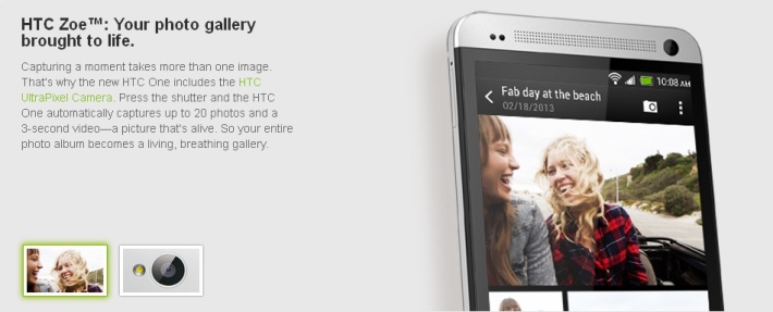
Finally, they have paired the updated camera with their HTE Zoe shooting mode. The Zoe shooting mode captures up to 3 seconds and 20 full-scale images by pressing the shutter once. The photo gallery will animate the Zoe captures after a short delay so you get an active gallery with more pizzazz than a typical smartphone grid. Finally, the phone can group them into highlight videos with a selection of themes and it’s easy to share any of this created content to social networks. So, they have tried to emphasize more than just raw picture quality in their value proposition for the Ultrapixel Camera as part of the HTC One.
 
Missed Opportunities?
I think that HTC could have done even more to emphasize the experience advantages of their Ultrapixel camera configuration. Ultimately, their website ends up trumpeting f-stop and pixel size as the new specifications to compare, but consumers are already trained that megapixels matter. For example, they should put the low-light and motion capture performance advantages more to the forefront. I fully expected to see some comparisons on their website showing similar images with and without the Ultrapixel sensor. They should show images of the same scene taken with HTC One vs. competitive flagship smartphones.
 
HTC should, and still could, tap into the social network community with photo contests on Instagram or Flickr featuring low light or motion capture as the theme.
 
Finally, they could have invoked some brand or celebrity to endorse their efforts. If they were to attach a popular camera brand or a popular photographer’s name to the effort, that could help them offer credibility to the consumer that they can relate to instead of f-stop and pixel sizes. They have had success with this approach by partnering with Beats for their audio solution.
 
Drew’s Conclusion
I think that HTC has made a decision to follow the path of designing for the customer experience, followed with the best marketing efforts they can deliver. I hope that the market is ready and receptive to a change from valuing cameras only on megapixel ratings. The whole smartphone industry would be better for it.
 

Articulate Wallets: Another great product design accelerated by Kickstarter

I came across a Kickstarter project that caught my interest. The Articulate Wallet is a sleekly designed new leather wallet that adds a new twist to the traditional wallet.
Articulate Wallet
You can visit their Articulate Wallet Kickstarter project and see more of their story, but the key is their effort to combine the best of the wallet and money clip:
We took all the great features of wallets and money clips and put them into one affordable, stylish,and sleek leather design.
articulate outsides
articulate insides
There are two unique approaches that I really like in their design:
  1. Elastic bands instead of leather pockets
  2. Special slide out pocket for most-used credit/debit card.
Fewer Pockets
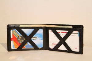
The simple single-fold design minimizes the amount of leather and material in the wallet itself. Also, the simple ‘X’ bands of elastic hold a small stack of cards on each side to allow you to carry multiple cards in minimal space. They would still be fairly easy to access. I just hope that they have done a good job choosing elastic that will hold up to the wear and retain it’s elasticity for a few years. This improvement applies to the very most common use case for the wallet – sitting in the pocket. Suddenly, your wallet is smaller in the pocket, less noticable, less uncomfortable. It also improves the closely related use cases of removing the wallet from a pocket and returning it there.
articulate x slot
Perfect Pocket
Besides the wide cash pocket, there is only one other pocket in the Articulate wallet. It’s on the outside of the wallet and it’s designed to give you quick access to your most used credit or debit card. Once you place a card in the wallet, you can slide it part way out the side of the wallet by accessing it from a slot in the pocket. Simply extend the card, swipe it for payment and slide it back securely in the pocket. If this works as promised, it’s a game changer for wallet design. I would love not having to open my wallet to swipe my credit card several times a day. It totally streamlines one of the most common use cases for a wallet – accessing the primary credit card.
articulate slide
An Experience Designed Product
I always enjoy seeing an example where someone has been inventive in improving a common object in a way that genuinely considers common use cases for the product. In this case, they have minimized the wallet toward a couple of really important use cases, pocket storage and credit card access. Some other use cases may be less-realized (no family photos, no fanning of cards for quick recognition, no ‘secret’ pockets, etc.), but for those that care only about the key functions, this will be a welcome trade-off.
I also have to give props to Kickstarter for giving these 2 college guys a chance to see their product idea through to reality. They have been able to take the project from design stage and meet the minimum order quantity with their supplier by leveraging the crowd-funding power of a Kickstarter project. Kudos, guys!
Anyone else interested in the Articulate Wallet? What do you think?

Taco Ocho: Experience Design Wins and Losses

I love tacos! I’m a Texan, so that shouldn’t be a shock to anyone. Foursquare has rewarded me for exploring the Mexican food category above all others. As such, I’m always on the lookout for a great taco place and pretty judgmental about my taco options. Today, I lunched at Taco Ocho in Richardson with Michael (blogs at MuCraft ) and finally tried the eighth taco flavor that I hadn’t tried before.

Taco Ocho is a locally-owned shop in a small commercial strip center near the office. I have been going there pretty regularly for about a year and a half since they opened in the late spring of 2011. It is definitely among my favorite taco shops and I have frequently run into friends there or encounter a nearly full dining room, so it seems pretty popular.

20130214-145155.jpg

Approach and Navigation
Taco Ocho has a very tried-and-true structure to greet customers once arriving at the restaurant. There is an open corner location with windows across the front, allowing a peek inside and plenty of light once entered. For a first visit, I really want to see inside and know that I won’t be surprised or feel trapped once I’m inside the shop. They have a handrail to separate the line on the left as you come in the entrance, so it is very obvious where to enter the line. A large board menu is above the counter, making it fairly easy to start making some selections. There could be some better signage to help entice and direct first time visitors with a bit more sense of what the experience will be.

The left wall has a large mural of a Spanish mission with sunrays that provides a hint of the Latin cultural basis for the restaurant and also a bold and lively precedent to the experience.

20130214-144712.jpg

Menu
Taco Ocho has divided their menu into 3 simple categories:
Tostadas – Vegetarian “salads” served on a flat, crispy corn tortilla base
Tacos – Flour or corn tortillas filled with meat and/or veggies
Tortas – Latin grilled sandwiches made with bollilo bread

Each category offers eight (or, ehm, ocho) pre-defined combinations. This is a pretty balanced number of options, allowing for some choice but not overwhelming even on the first visit. The drink options are pretty limited with a few bottled sodas, fountain drinks and tea. I was glad to discover crushed ice from the dispenser – always a bonus in my book.

Learning Curve
The simple approach and the limited menu makes a pretty shallow learning curve for Taco Ocho. You won’t struggle to avoid standing out as a newbie, even on the first visit. Plus, most of the choices are good, so feel free to experiment and try. They will even offer suggestions if you ask.

Unfortunately, there isn’t much depth to the menu or experience. I always get 2 tacos, and enjoy mixing among the choices. However, since there is very little room for customization or personalization, there doesn’t seem to be much depth to discover here on repeat visits. Today, I completed my sampling of tacos, so I have nothing left to explore there.

20130214-144926.jpg

Immersion & Place
I think Ocho has an interesting place. The restaurant has mostly modern ‘industrial’ decor with metal chair, flat white tables, pendant lights, a red brick wall, and concrete floors. The food itself has deep latin and Mexican roots, but also has that same sense of modernism, with refried black beans, rice seasoned with cilantro and corn, and small light tortilla chips the standard sides for a taco plate. Overall, I think that Taco Ocho achieves it’s ‘mission’ in the interior design, providing a modern, trendy feel.

The decor has a couple of drawbacks that seriously diminishes the immersion of the experience. First, on multiple occasions, I have sat is a spot directly under the air conditioner vent and it is blowing a strong current across my food and me. I have even changed seats to avoid this during summer months. Second,they use pagers to let you know when the food is ready. This is a small place and I wish they would just bring food out so that I don’t have to interrupt and get back up to fetch food. Finally, with all of the hard surfaces and tight tables, the noise level is excruciating during most lunchtimes. It’s not a pleasant place to sit and enjoy a thoughtful conversation. Each time, I’m anxious to get up and go as soon as I finish eating. On the surface, this may seem to serve Ocho’s interests in freeing a table, but I would argue that I’m more likely to skip it over on a day that I’m not up for the noise and it costs them my business at times. Each time, I’m as happy to leave, hearing the door close and experience the relative quiet of a busy street, as I was to arrive.

As a professional in product design, I notice that this is a specific use case that they have neglected. They have done a great job on the food and visual decor, but the practical value of relaxed comfort while there has been neglected or overlooked by the owner. Maybe they didn’t consider that they are not just offering food, but for many, a social experience with their friends or family.

20130214-145126.jpg

Predictability & Variety
Taco Ocho definitely leans more toward predictability than variety. I have tried all of their tacos and have liked all of the choices, but definitely have my favorites. Latin Love has shredded beef, refried beans, and fried plantains. I love the sweet and savory taste of this taco on corn tortilla and order it almost every time. It’s only flaw is that it almost always is runny and a bit messy (unless it’s too dry which is worse). Chicken Elote is smoked chipotle chicken with corn, cheese and cilantro. This one sounded mundane, but I really like the balance of spices in the chicken. Cabo Fish is beer-battered or grilled fish with jicama slaw and a chipotle cream sauce. Hard to beat a tasty fish taco like theirs.

20130214-144757.jpg

The variety is harder to come by unless you are happy between the 3 options they have. I have only ordered tacos so far, and definitely want to try some of the others, but I wish that I could mix up some of the options to create some taco choices of my own. Or, failing open options, I wish that Ocho would offer special features from time to time to keep things fresh and interesting. It seems they are strong on the ‘taco’ and limited by the ‘ocho’.

They do have special Mexico City Street Tacos on ‘Taco Tuesday’, but I haven’t tried them yet, so I need to make an effort to aim for that some week. Variety is definitely a miss for us fans that have been coming since the opening.

The Payoff
Whenever I evaluate a product or service from an experience perspective, I always ask, “What is the Payoff?” For Taco Ocho, this one is pretty easy. They offer a unique and tasty taco with enough variety to appeal to many tastes. They have room to improve their overall experience design and menu, but it still rates highly with me.

Have you been to Taco Ocho? What do you think?

My First 30 Days Experience with a BMW

So, it’s now been a month since I bought my latest car. It’s a 2010 BMW 328i. I feel fortunate to find such a great used car that fit in my pre-decided budget. I was looking at a lot of cars and was getting serious about buying a used Nissan Maxima SV.

The BMW Choice
My BMW is the first one I ever drove. I had a couple of friends suggest that I should at least check into BMW before my final decision. I was honestly surprised that I could get a late model 3-series in my budget. I found a compatible BMW at the Infiniti dealer (my last car was Infiniti so I’m familiar with the dealer already). I went and made a test drive with my wife along for the ride. It only took a short drive for me to like it, a lot. The dealer had a Maxima SV fully-loaded also in their inventory, so I was able to compare side-by-side and drive-after-drive.

The Maxima offered a slightly bigger car, bigger engine, a panoramic sunroof, iPod integration, rear camera and navigation with a large display. The BMW had none of those amenities, but the driving experience won me over. I loved how it feels very connected to the road, with a perfect balance of dampening between true sports car feel and luxury car feel. The steering is much tighter and more responsive than my previous cars. The bucket driver’s seat is supportive and supremely comfortable with great alignment to the pedals and the wheel. Anyway, I loved the drive and bought the car the following day after sleeping on it (or trying to).

Expectations Met
After a month of ownership, my experience with the car has been exactly on point with my expectations. I enjoy driving it whether on my daily commute or the occasional highway stint. In fact, my enjoyment has only increased as I continue to adjust to it. There is a part of me that wishes I had the extra amenities the Nissan would have included, but the pleasure of driving more than makes up for it. Besides, I’ve never had those features so I don’t really miss them. And it does have some great amenities like keyless entry and start, heated seats, smart climate controls, sunroof, and more.

A Mind of Its Own?
I have wondered if the BMW is smart and helpful, or just a smart Alec. Like a lot of cars with keyfobs, the BMW sets seats and even mirrors for the driver. This has been a bit of a confusion for me, so I need to read up since the controls on the side of the seat are hard to study while seated. Still, I have found the mirrors still adjusting as I pull away and that can be disconcerting. Plus, it seems that often, I set them and they still revert to a preset immediately after. Another example came up today since it was a bit rainy at moments this morning. I set the wipers on the intermittent mode as I headed toward the school for drop-off. My daughter and I both noticed that the timing was very uneven between wipes. I’ve got to figure out if there is a sensor that is determining the delay or perhaps something is wrong with the wiper relay. Whatever the case, it was ranging from 3-7 seconds delay, and seemed rather random at that. I think my car is a bit overconfident and needs to get to know me a bit better before it starts making decisions for me.

What Were They Thinking?
There is one design decision that I really don’t get. The only button in the car to lock or unlock doors is right in the middle of the center console. There is not one near the door. If I approach the car while I have passengers, the front door will open for me, but the back doors remain locked. I have to get into the car before I can reach the unlock button on the console. A button on the door would be easier to access and much more logical. Maybe there is an explanation and they thought about something less obvious to me, but it feels like a miss in the experience design. I’ll probably get into the habit of pressing the unlock button on the keyfob when I have passengers, but it definitely detracts from the simplicity and value of the keyless entry solution.

How is the BMW Experience?
Overall, I’m quite satisfied with my choice of car to drive for the coming years. It looks great, feels comfortable, has some nice features, and most importantly is very fun to drive. I guess some might take issue with their brand message: “The Ultimate Driving Machine”. I would have to say that at least they picked the category that matters to me. It is at least my ultimately matched driving machine for now. A lot of products offer bells, whistles, and other enticements, but many times, the greatest satisfaction and customer experience comes from doing the one right and important thing really well. Sure, a lot of problems could ruin that experience, but as long as everything else is OK, I’ll gladly go along with it to get such a superior driving experience.

Have a great car experience? Tell me about it in the comments.

Infiniti’s Naming Pivot: The 2014 Infiniti Q50 and what it means for the brand

Infiniti recently announced it’s new Q50 sedan at the North America International Auto Show (Detroit). As a former owner of this model of sedan, I was very anxious to see what the new version would bring to the table. There is plenty, but the thing that has most captured my attention is the name. If you’ve never heard of Infiniti Q50, don’t feel left out because I hadn’t either. It is the new name for their G-series sedan.


    Infiniti Q50 front


What’s in a Name?
My car was a 2005 Infiniti G35 that I bought in 2005 and drove for almost 8 years, selling it just this past month. The G35 name helped identify where it fit in the Infiniti lineup. The G was smaller than the M or the Q and sat in the Near-Luxury segment. My G35 hosted a 3.5L 6-cylinder engine. More recent models were named G37 since the engine was upgraded to a 3.7L version. They also introduced an economy option for recent years named G25 with a smaller 2.5L engine. Thus, the number in the name helped identify how powerful the engine would be.


Why Q50? What does it mean?
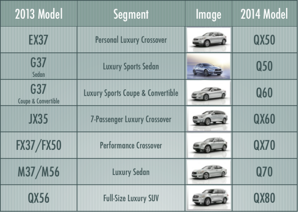
It seems the effort is to simplify the naming for Infiniti models. All of the models will start with Q for cars and QX for SUV and Crossover models. The number will line up with the segment or pricing tier. Only the Q50 is formally announced so far. Most of the others will just receive a typical refresh along with renaming as they show up in their 2014 form. The chart below shows the current model name, segment and the future 2014 model name, in order of base model MSRP.


Infiniti Grid


What do I expect now?
From a branding and product naming perspective, I can see that they are correcting the misalignment of the FX-series currently which is priced higher than Gseries or JX-series which are named with higher letters. Also, I can’t help but notice that they are echoing the naming of some other luxury brands that have similarly moved away from engine displacement or cylinders in their naming conventions, such as Audi and BMW. The QX60 will be competing with the Audi Q6, the BMW X6, and the Volvo QC60. It’s pretty easy to see that the Infiniti naming will help reveal and reflect this matchup.


Is this decision made in the Office of Redundancy Department?
One of the things that bothers me is the use of Q for all of the models. I think they are trying to bring the goodwill that their Q-series sedan has enjoyed as the flagship to all of their models. The problem is that it now serves no purpose in distinguishing between the models. So only the ‘X’ and the numbers will help at all. So, the Q becomes redundant except as an identifier for Infiniti. Yet, Audi, Volvo, and others use Q in their own model names.


And, even the number is much less meaningful from a product perspective. It does help line the products up in order of price, but it tells you nothing of the powertrain or any other characteristic of the product.


I’m afraid that starting over with new naming scheme after 23 years of history will confuse customers. It will all just sound like a random series of letters and numbers to those who don’t take time to study the whole product line in context. In fact, I would rather see them use REAL names so that you can easily remember the name, share the name, talk about the name, and remember the name. Also, over time, names can evoke a past and heritage that initials and numbers struggle to convey. Names like “Stingray”, “Beetle”, “Cobra”, “Woodie” and many, many others instantly etch an image in the minds of us long-time auto enthusiasts. In mobile phones, we have rapidly tried to grab and use names to build brand recognition where there are new products every year. The auto industry has a lot of legacy and long product cycles, so names can build and grow over an even greater time.


How do they introduce new models?
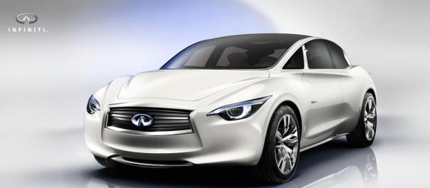
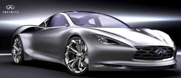
It also seems that they have not left any room to add other models into the mix. What if they need to add one of the exciting concepts, like the Infiniti Etherea or Infiniti Emerg-E concepts from their website (see http://www.infiniti.com/us/models/future_models/). Currently, all of the models are separated by nice even multiples of 10 without gaps. That won’t last, so eventually they’ll end up with a messy spread of numbers. I would expect them to struggle not to oversell new models by implying a higher segment placement than they warrant.
Infiniti Etherea
Infiniti Etherea Concept


Infiniti EmergE
Infiniti Emerg-E Concept


Did they pivot in just name or also strategy?
I guess my real concern as I reviewed this, and captured my thoughts here, is that Infiniti is really changing their naming scheme so that they can change their product strategy. Infiniti has always been about performance and luxury. Thus, using the engine displacement in the model name helped distinguish an Infiniti from the competing models from other luxury brands. G35 was upgraded to G37 and you knew that the raw power also increased. An M56 has a measurable advantage over an M37 in performance. I understand the reality that cars are not just about raw horsepower or engine displacement anymore. There is much pressure to improve fuel economy and efficiency and Infiniti wants to capitalize on that trend. They plan to release as many as 15 hybrid models by 2016. I just hope they don’t lose the essence of their brand identity in the process.


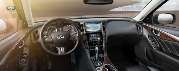
Of course, the technology package that is featured in the new Q50 seems to be a good sign that there is plenty more to distinguish an Infiniti than just raw performance. The dual touch-screen center console interface looks like a step in the right direction. Bring on the future of Infiniti…


Infiniti Q50 interior


Please add comments or questions below!

Instagram “Feeds” Its Followers

Instagram has now made the feed accessible to the web. Check it out at http://www.instagram.com
You can see your normal Instragram feed along with comments much as in the mobile app.
Instagram on the big screen
The first thing that I notice is that the display on my laptop is much bigger than my phone. This is both good and bad. The flaws in the image are much more apparent, but you can more fully enjoy a truly epic shot. I think overall this is a net plus vs. the phone experience.
Keep Your Comments In-line
Similar to the mobile interface, the poster’s first comment and a few of the most recent comments are displayed below the image. This is a good alternative to forcing an expand to see comments or listing all comments in line. You get a flavor for the interaction, but can scroll on by without a challenge.
Like and Comment All You Want
The web interface makes adding a [heart] or comment to a photo about as easy as the mobile interface. You can click a nice-sized icon or double click the image to like it. A comment bar is always accessible below the current comments, so you can click there are start typing. Of course, for most of us, typing on the computer is much easier than entering comments from the phone, but adding emoji will be quite tricky.
Proper Profile Page
This one isn’t as obvious at first, since you will just be in a normal feed, but once you click on an Instagramers avatar, you will launch their profile page. This page is great. Much like the mobile version, it shows your avatar and your profile text, along with your number of photos, followers, and followings. Fortunately, the banner is more than just the text. Instragram creates a collage of your images that will slowly transition to different images in a grid pattern.
InfiniteEye Instragram Profile
This is a much better way to highlight an artist or user and I hope to see this in an IG update of the future for the mobile version.
How Will a WebFeed Impact the Community?
It seems that this is another example of Facebook effect on Instagram. I like that I can access from the web and it gives me a place to send people other than Tumblr or Flickr for my Instagram photos. Of course, on the other side, the community becomes just a little bit less cozy and intimate. I honestly miss the early days of Instagram and all of the community that was fostered by the mutual activity in their carefully confined garden. But, that hasn’t been the reality for awhile and certainly not since Facebook acquired the service. So, we might as well enjoy the convenience of having easier access to our feed and easier presence for our followers and new fans.
Check it out and let me know what you think. Will it change Instagram? Is it better than the mobile experience?

Amazon to hand out some serious coin

Amazon announced their new virtual currency, to be called Amazon Coins earlier today. Coins can be used to purchase apps, games and in-app items for Kindle Fire. They also pledge to give away “tens of millions” worth of the coins starting in May when the new service/product launches. See Introducing Amazon Coins.

I think it is smart for Amazon to provide another way to ease the purchase of content in the Kindle Fire ecosystem. Also, I imagine that they will give Coins away with purchases of Kindles and probably with lots of other goods, too. It will be interesting to see where Amazon ultimately goes with this, but here are some of my initial ideas.

Fire Halo Effect
I could see a small kick-back on purchases whether you have a Kindle or not. Soon enough, you’re going to want to have a Kindle so that you can cash in all of your earned Coins. Could be a serious draw for the ecosystem. I know that I spend a fair amount annually with Amazon. If they give me a small percent of credit toward virtual goods on their platform, it could make that seem more attractive.

Coins Aren’t Real Money
I also believe that they will make it easy to buy Amazon Coins or give them as gifts or in-app incentives. Once real money is translated to Coins, Amazon wins! You will spend it at Amazon on virtual goods giving Amazon an easy 30% commission. Also, you’re likely to have some residual coins drawing you back to add or earn some more. Finally, it seems much easier to spend virtual credits than real dollars and cents.

Kindle Everywhere
Could it also be a way to create more loyalty to their virtual goods over time. I wouldn’t be surprised to see Amazon Coins accepted for Kindle Books or AmazonMP3 to be read and played on other devices, like Android phones and tablets or Apple iDevices. Could be a great way to create lock-in for their virtual marketplace. This would build loyalty toward their marketplace and not just the Fire device portfolio. Amazon’s devices have been created to support their “Long Tail” marketplace, not the other way around.

Drop Some Coin for Anything
Another obvious extension of this would be to allow Coins as payment for all kinds of goods. Want something shipped to your house? Amazon Coins could be a great way to get me to choose Amazon for real-world goods also.

What Did Facebook Miss?
Before I close, it’s worth noting that Facebook failed in their attempt to create a virtual currency for their apps and games. They ultimately abandoned Facebook Credits and just returned to national currencies. This may partly explain why Amazon has defined Coins narrowly for now and will offer only in the USA market at launch.

I wish them luck and can’t wait to see how this develops. Any other ideas or thoughts? Comment below!

See also: http://www.theverge.com/2013/2/5/3955202/why-amazon-wants-its-own-currency

Whether on the Vine?

Vine in the News
Twitter’s new service, called Vine and found at vine.co (that’s “dot company”), is already making headlines today. It seems that they allowed an explicit video to be promoted into their “Editor’s Choice” list which is automatically placed into every users feed. Fortunately, it was stopped before I experienced that shocker.
I hope they figure out quick how to eliminate that possibility cause that’s a deal-breaker for me and my family. Especially since there doesn’t seem to be a great reason to invest time on Vine other than amusement (not that fun is bad).
The Vine blog introduced the service last week as follows:
Posts on Vine are about abbreviation — the shortened form of something larger. They’re little windows into the people, settings, ideas and objects that make up your life. They’re quirky, and we think that’s part of what makes them so special.
I hope that some more “people, settings, ideas, and objects” emerge beyond the focus on quirky and humorous that is the current trend. Not that i don’t enjoy shoes walking themselves or cats disappearing, but I think the service deserves to be more than that and needs to be to hold my attention long-term.
Experience on the Vine
From an experience perspective, they did some things very well. I really like the way that new videos are created. Like Instagram for photos, Vine succeeds in making video-creation accessible to the masses. To create a video, you simply hit the camcorder icon and are presented with the viewfinder. The camera records while you are touching the viewfinder and pauses if you let go. This continues until you fill 6 seconds (or quit sooner). So, you can easily catch small chunks and form something in moments. Then you see a preview of your video looping as it will on the service. At that point you can post or discard it. The only complaint here is that if you choose not to post, it won’t be saved to your phone gallery either. I took a short clip of my daughter at lunch that she didn’t want me to post, amd it’s gone forever.
Also, I like that you can scroll through a feed and the videos just start playing. Scroll down and another one loads quickly and starts playing. Vine did 3 things that really make the browsing snappy:
  1. Short, looping video = loads quickly and keeps playing
  2. No play button = the videos play immediately, draws you in immediately
  3. Endless page feed = scroll down and find another video
These design decisions work together to make the browsing pretty effortless and tends to make you scroll down for ‘just one more’ clip.
I think Vine will find an audience. I hope that there are some artistic, content, and community values that develop over time.

Find me on Vine as @DrewWilken or check my twitter feed. It’ll probably continue to have some Vine’s crawling about.

Design With Soul

Design # User experience # Craftmanship

Kyocera News Reel

Daily news about Kyocera Communications & the wireless industry

Grumblings of a Yorkshireman

Eat all, drink all, pay nowt. Ear all, see all, say nowt...

retail must burn!

design strategies on how to stand out in an over saturated market / by Régis Péan

Proto Partners Service Design Blog

Make Every Experience Count

Duskpony

...rants on design, user experience

EverFaith

Words about faith, life, love, and the journey

Return On Customer Experience

An Exploration of All Things Experience

MDH Mark D Hogan

Brand Marketing Blog

Top 10 of Anything and Everything

Animals, Travel, Casinos, Sports, Gift Ideas, Mental Health and So Much More!

Adam Coomes

tech | rants | stuff

DrewWilken

Just a geek with my own perspective...

WordPress.com News

The latest news on WordPress.com and the WordPress community.